DEMEL
Strategy
Branding
Art Direction
Website
Packaging
Role
Art Director
Design Lead
Design Researcher
Collaborators
DO&CO Special Projects Team
Web Development by Propeller
Photography by Sofia Kabelka
Designed with Dan Cottrell
Features
Brand New
The Brand Identity
The K.u.K. Hofzuckerbäckerei Demel is a traditional coffee house and patisserie in Vienna founded in 1786. A culinary and cultural institution, it is part of the fabric that makes up the central, bustling streets of the Austrian capital.
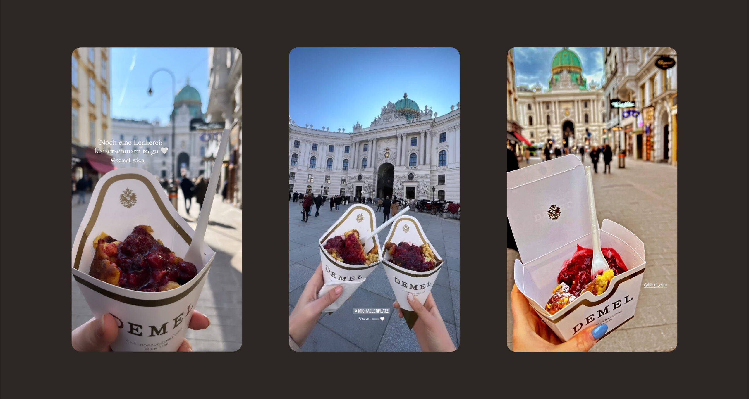
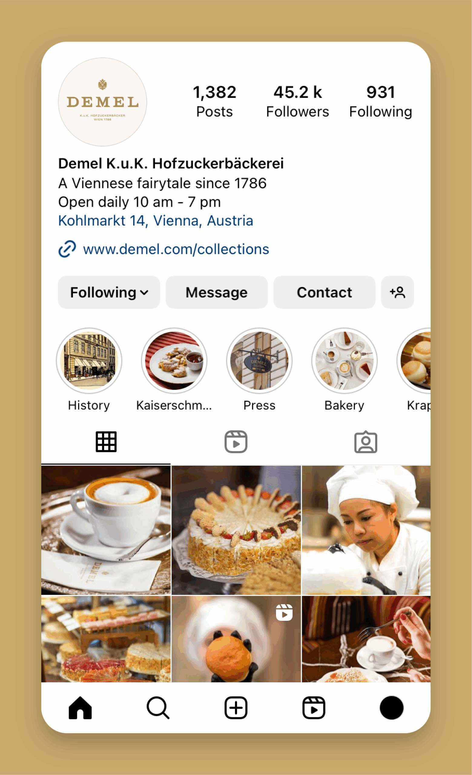
Always a popular tourist destination, it became clear that Demel would need to shift its brand in the wake of the pandemic and become more digitally effective with a new web shop and a stronger social media presence, as well as offer take-away packaging.
THE HISTORY
←
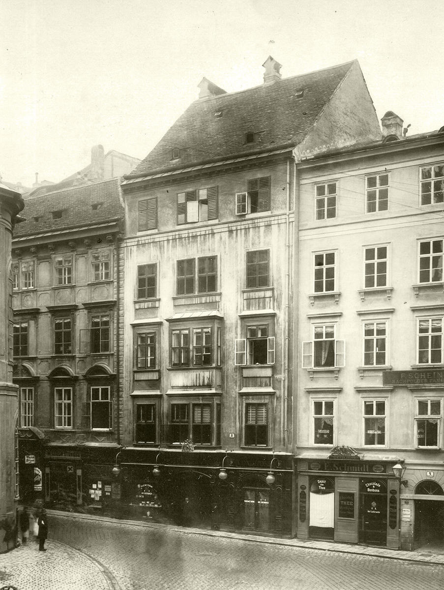
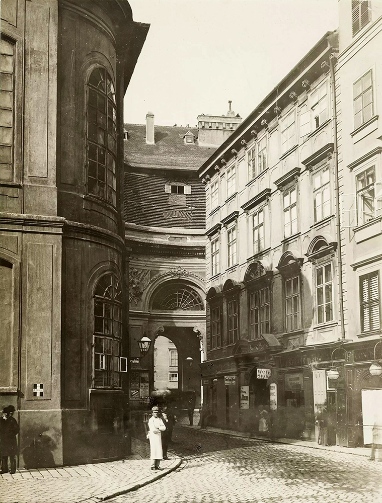
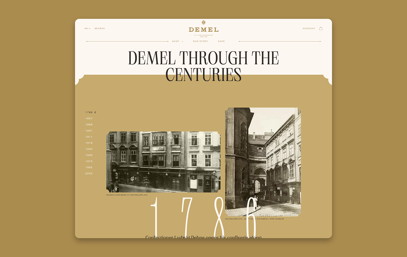
The confiserie was founded by Ludwig Dehne in 1786 along Michaelerplatz across the former Royal & Imperial Hofburgtheatre in Vienna.
It became the go-to spot for theater goers after a performance, and soon the confiserie began to deliver sweets and sorbets to the Hofburgtheatre so they could be enjoyed during intermissions.
→
When the Dehne family line ended, the now-famous patisserie was passed on to Dehne's first apprentice: Christoph Demel.
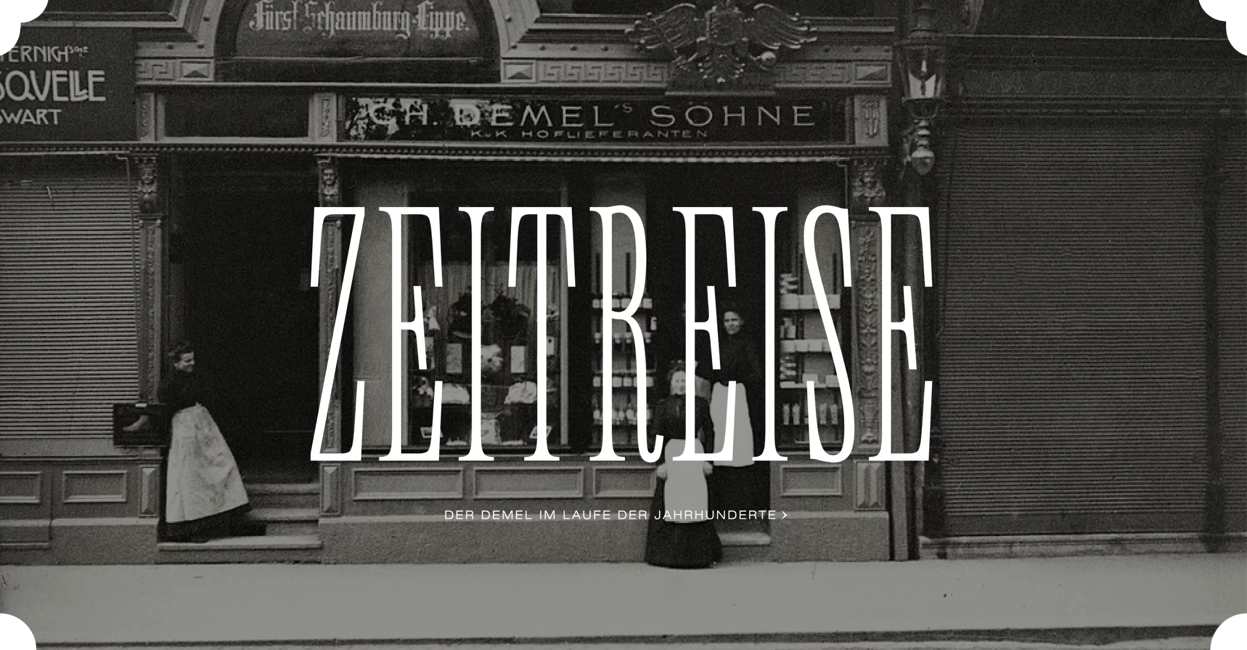
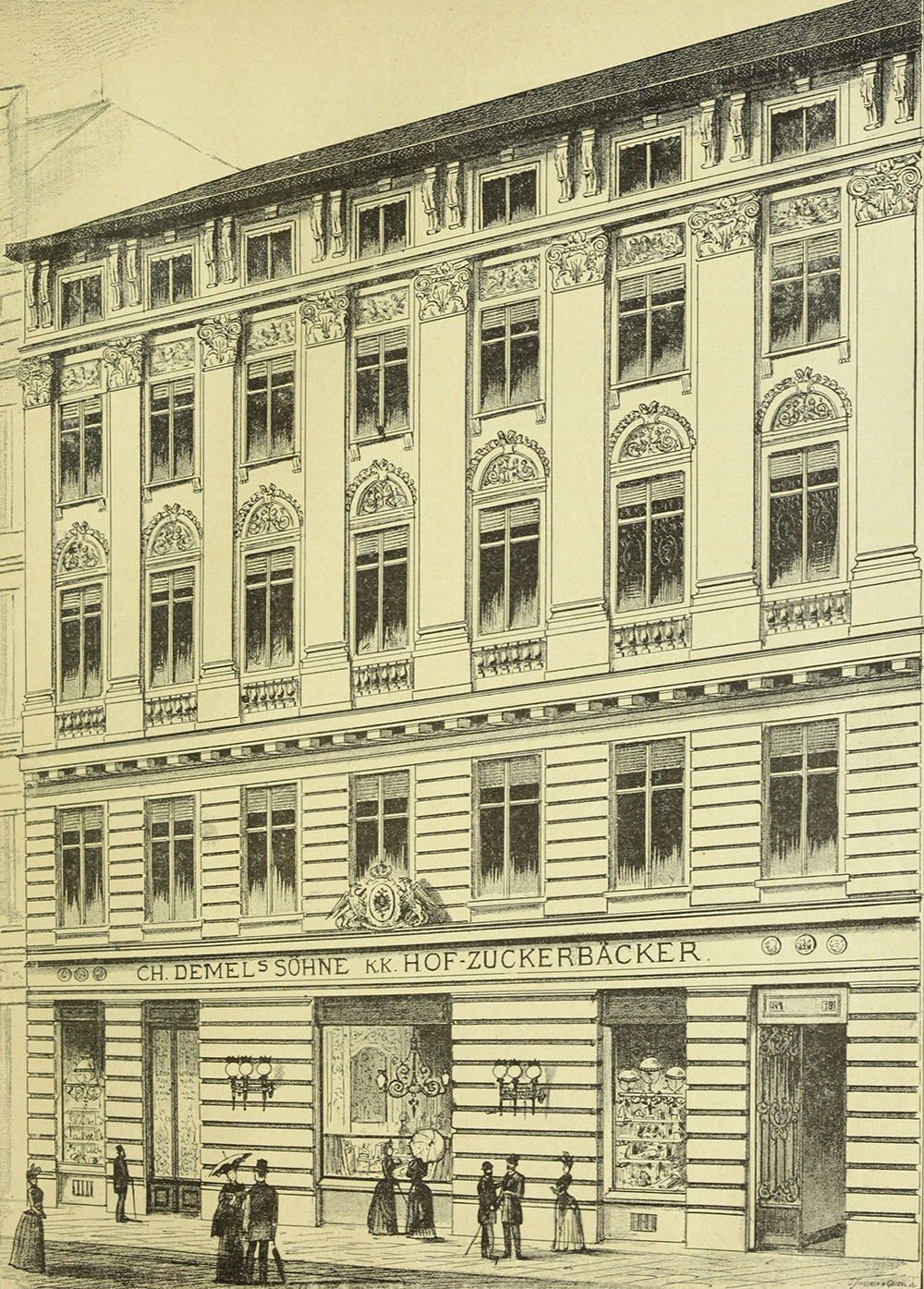
Due to the imperial urban refurbishments across Vienna, Christoph Demel's sons, Karl and Joseph Demel, moved the patisserie to the ‘Palais am Kohlmarkt’ in 1888, which is where it is located to this day.
→
Demel was frequented by many aristocrats, even delivering to the palace on a regular basis - making it a Kaiserliche und Königliche Hofzuckerbäckerei, or a Imperial and Royal Court Bakery.
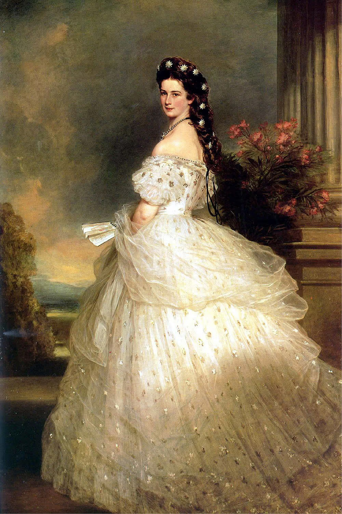
Empress Elisabeth (Sisi), who was notoriously particular about her food, was a big fan of Demel's violet sorbet and would enjoy it almost daily.
→
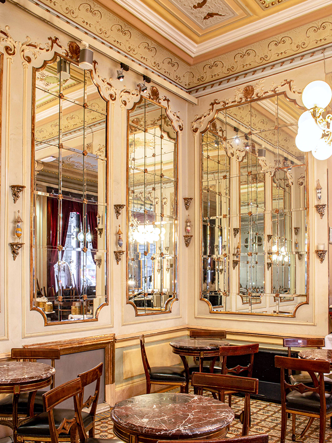
Viennese "Kaffeehauskultur" is a crucial part of Austria's cultural fabric, with cafés often acting as a second livingroom.
Those that went to Demel not only sought out coffee and delicious Sachertorte, but an experience that felt decadent and glamorous. Sometimes complete with celebrity-viewings and gossip from the imperial court.
→
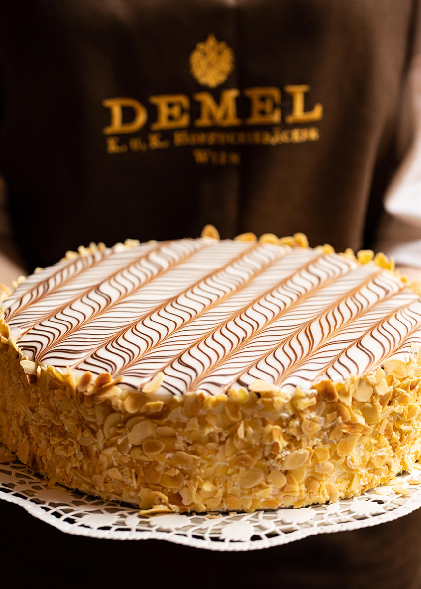
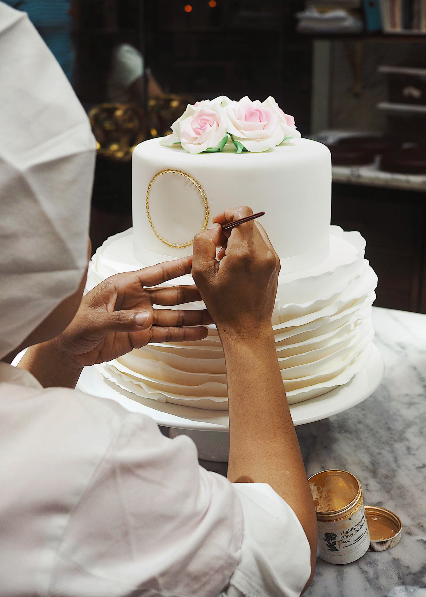
Vienna's standards for cakes, tortes, and pastries is incredibly high. Demel has maintained its reputation for creating decadent, masterfully executed cakes made from recipes that were developed and perfected many generations ago.
←
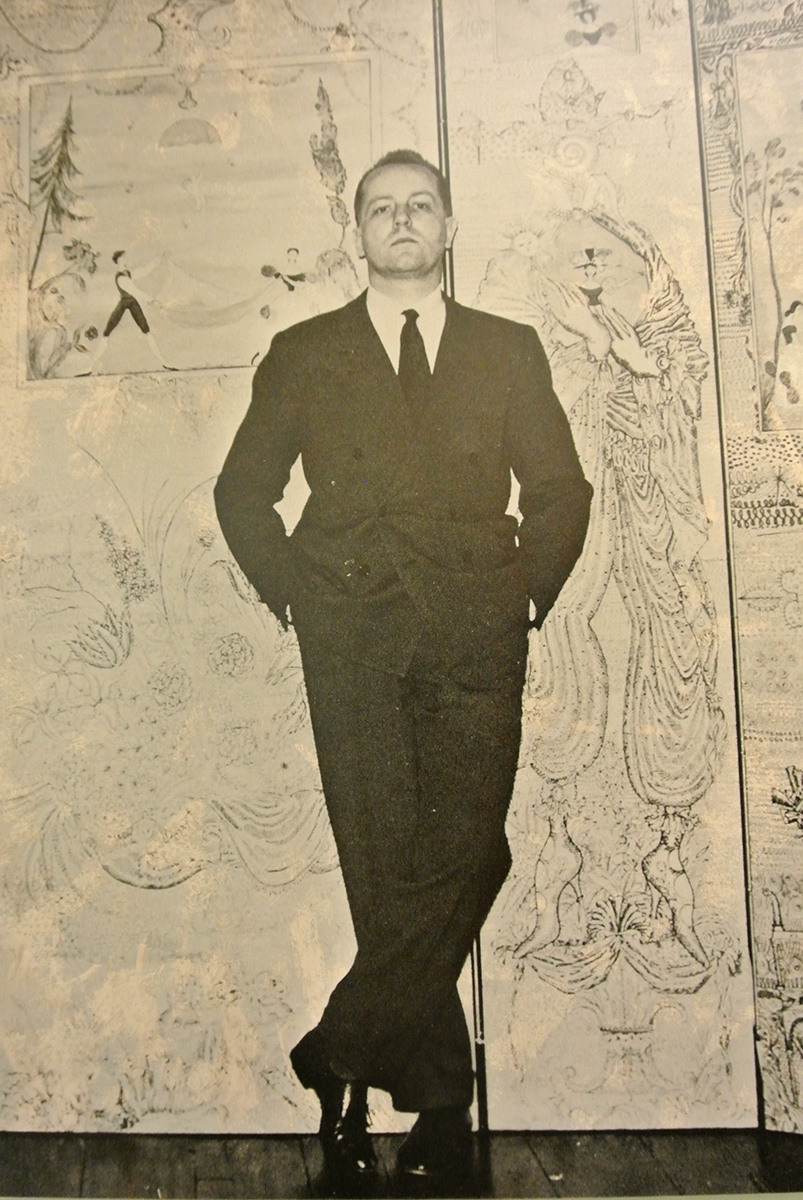
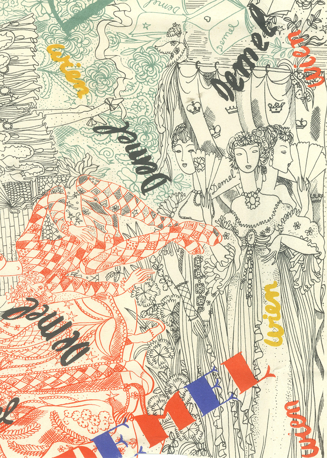
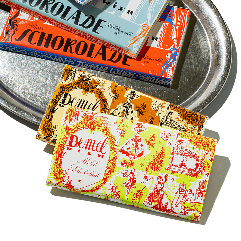
Demel had many eccentric owners, but few offered as much artistic vision as Baron Federico of Berzeviczy-Pallavicini (*1909; † 1989). His playful illustrations and decorative window displays became the hallmark of Demel's brand throughout most of the 1900s, and were a breath of fresh air as Austria grappled with the end of its imperial status.
→
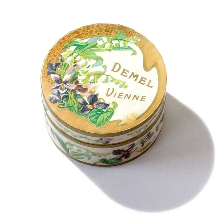
The packaging at Demel has been incredibly varied, often acting as an example of the art movement at the time of a product's inception.
Today, many of Demel's most successful pieces of packaging are remnants of the Jugendstil movement or the Wiener Werkstätte.
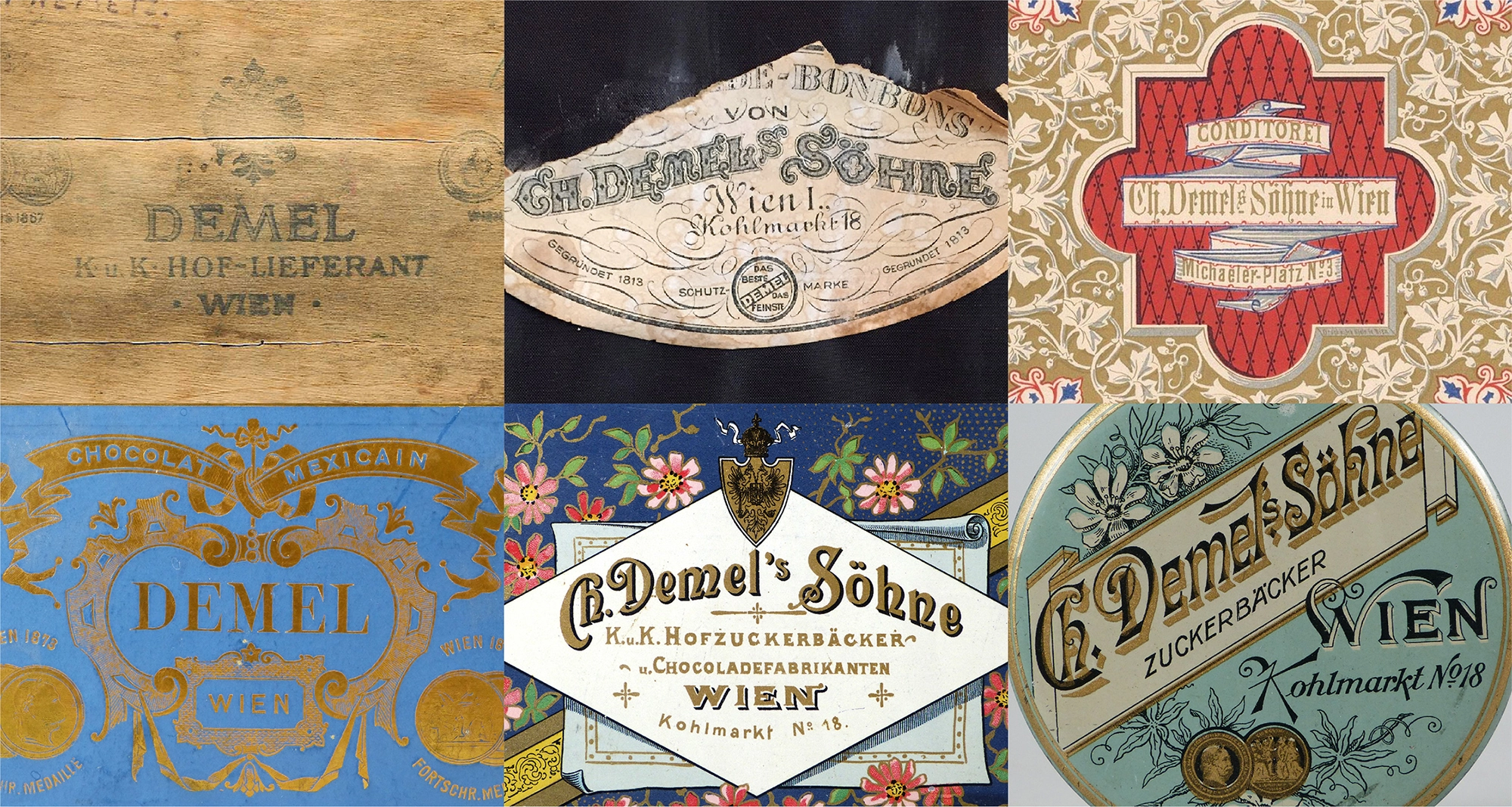
There was no unifying logo throughout Demel's long history, prior to the late 20th century. A plethora of designs existed across packaging, signage, and other applications, however most of them would include "Vienna" and Demel's address at the time.
→
Since DO&CO's ownership of Demel began in 2002, the logo was an outlined serif paired with Garamond and the Habsburg eagle.
The wordmark was in need of a refresh and the intricate eagle didn't retain visibility on most applications.
THE LOGO
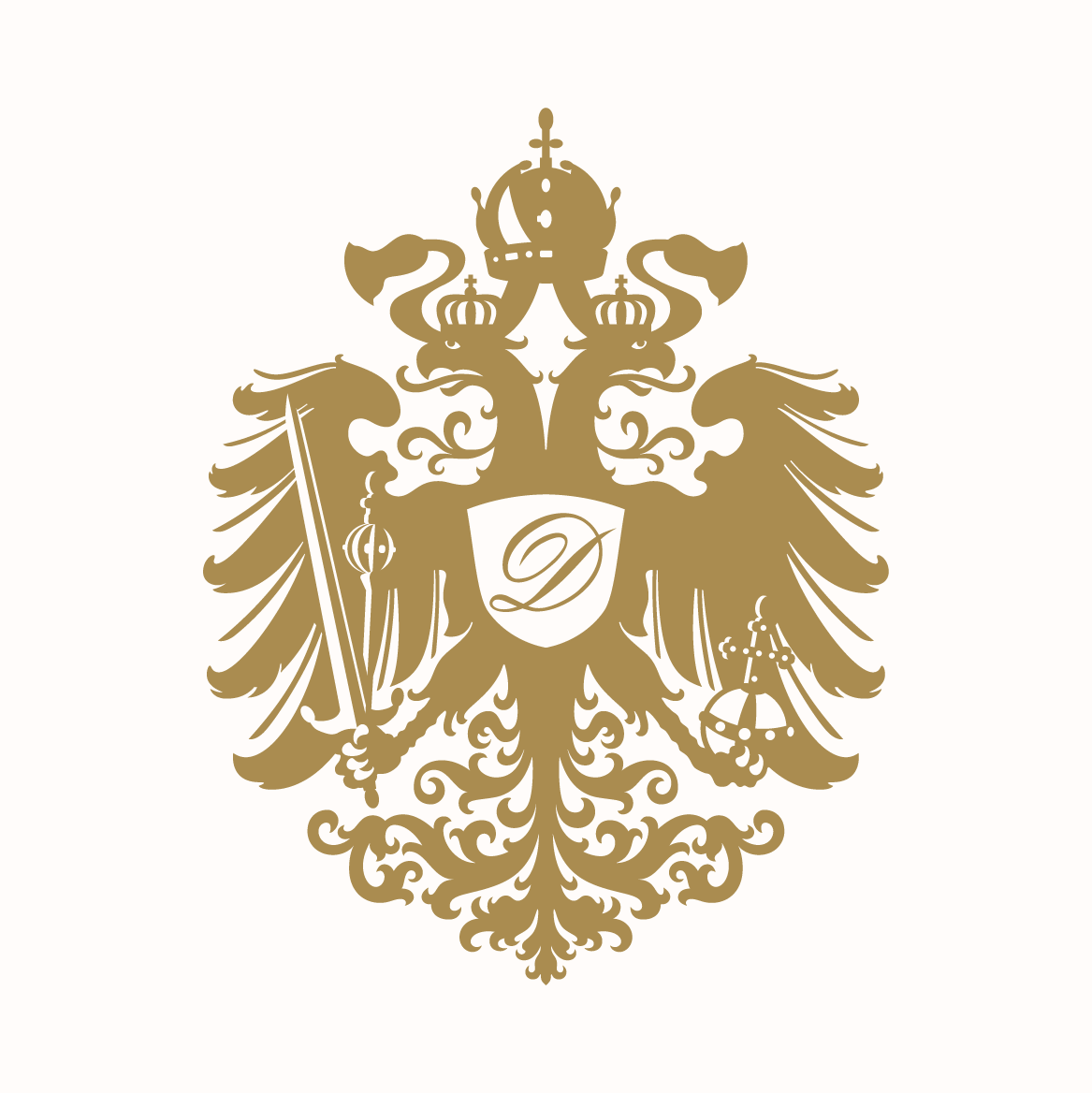
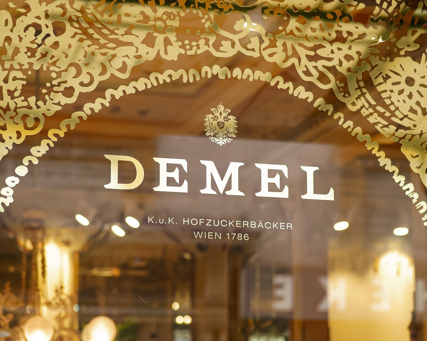
The logo underwent a soft evolution: the Habsburg eagle is redrawn and scaled down, the Demel wordmark is simplified, and the tagline is set in the clean sans serif, Swiss 721.
Additional negative space helps each asset breath and makes the overall logo feel more luxurious and modern.
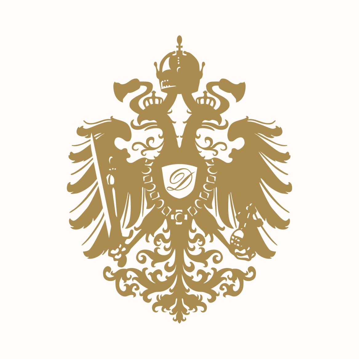
Before
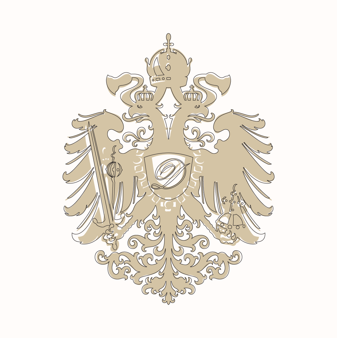
After
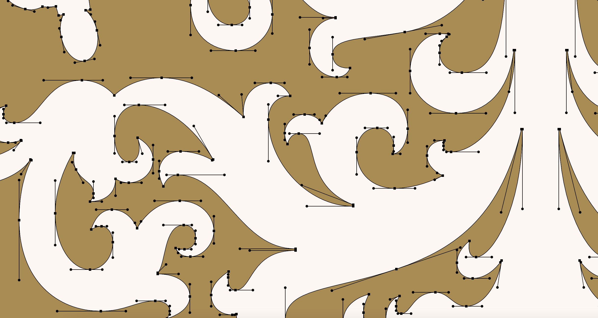

A simplifed version of the eagle was developed for small applications and printing methods such as foiling and screenprinting, which the standard eagle was too detailed for.
Standard applications
Small & hard-to-print applications
Very small applications
BRAND ASSETS
←
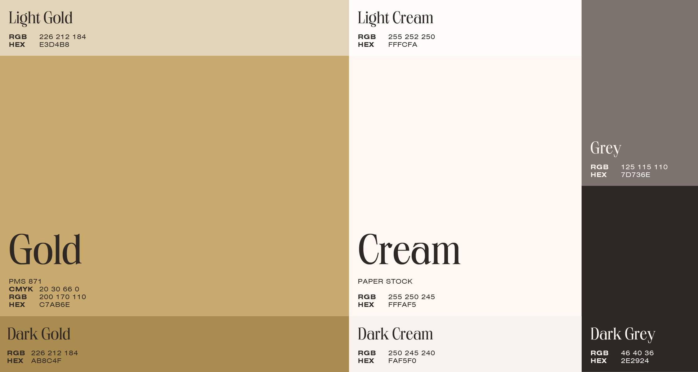
A caramel gold is used as the primary colour in the palette, with a cream colour acting as its main contrast. Warm shades of grey, and light/dark variations of the gold and cream act as support for digital applications.
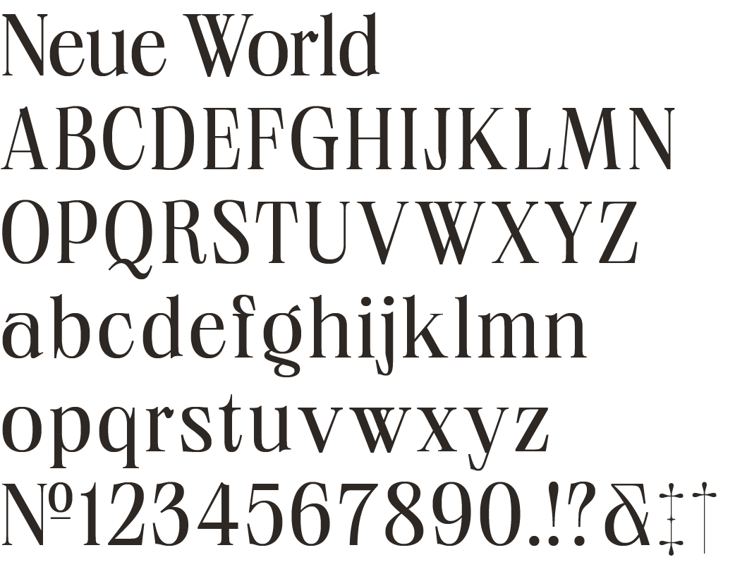
Neue World is an elegant, while playful serif, and was chosen for its large selection of widths and weights. Designed by Pangram Pangram ↗
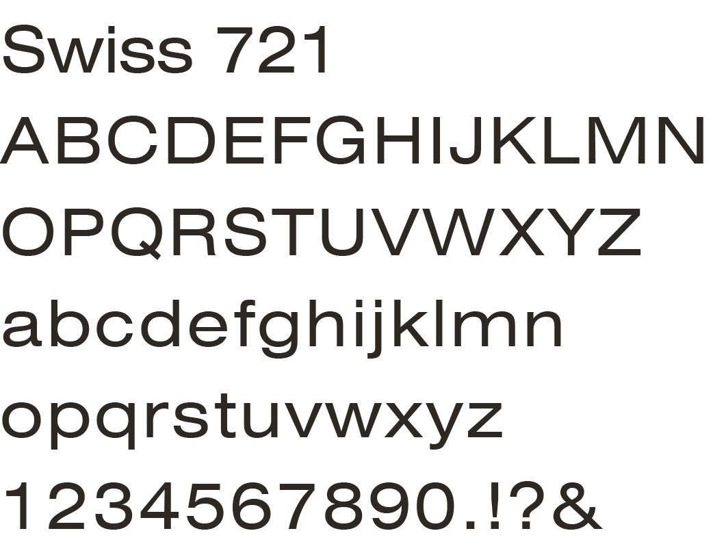
To contrast the ornateness of Neue World, we use the clean, modernist Swiss 721 in its extended format for informative copy, mostly on digital applications. Designed by Max Miedinger ↗
→
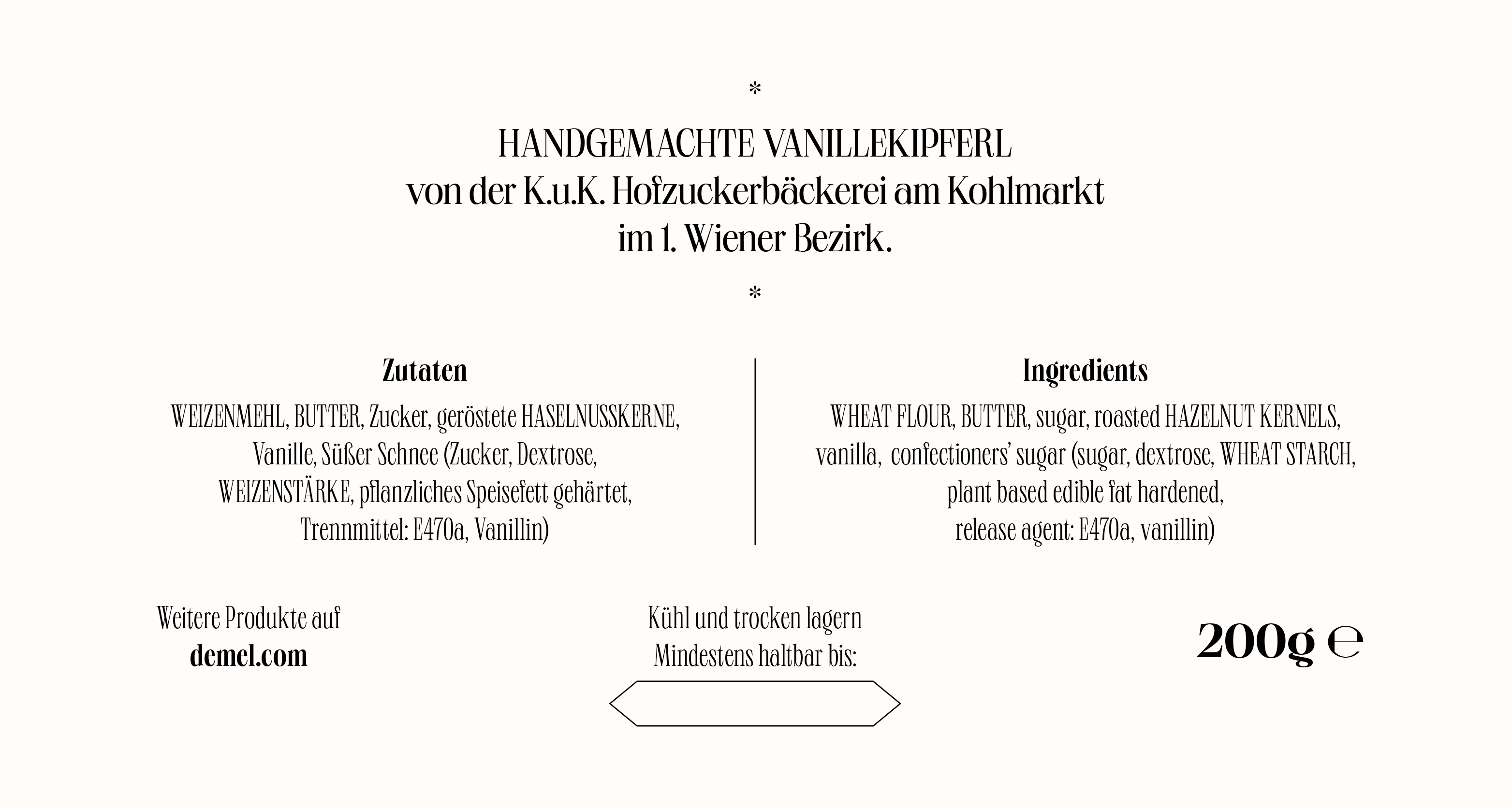
Headlines are in all caps, with supporting copy ranging in width and weight for different hierarchies of information.
All copy is centre-aligned for a sense of elegance and traditionalism.

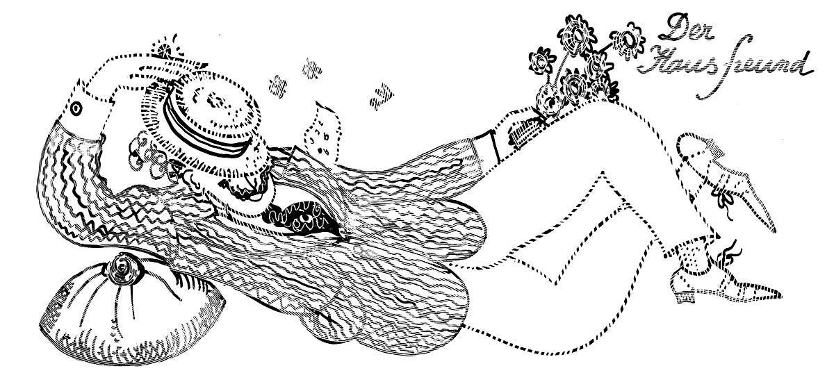
←
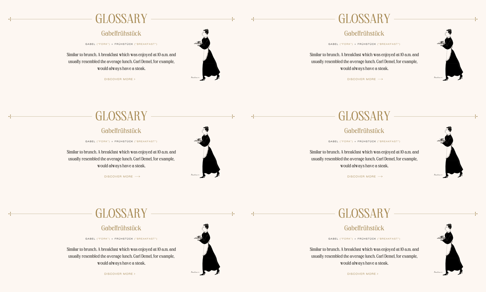
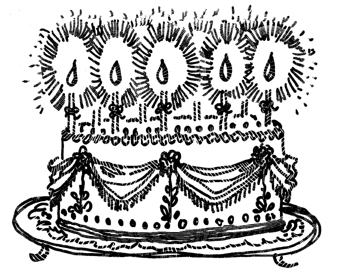
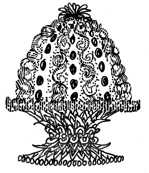
Baron Federico of Berzeviczy-Pallavicini, artistic director and owner of Demel for a portion of the 20th century was a talented illustrator.
A library of his characters were digitised to be used throughout digital applications for a sense of playfulness and heritage.
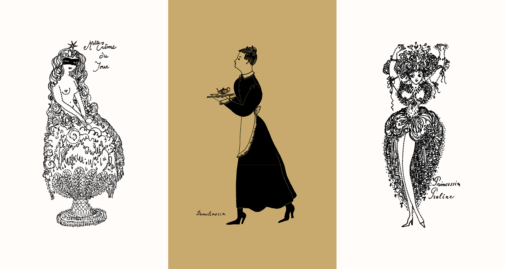
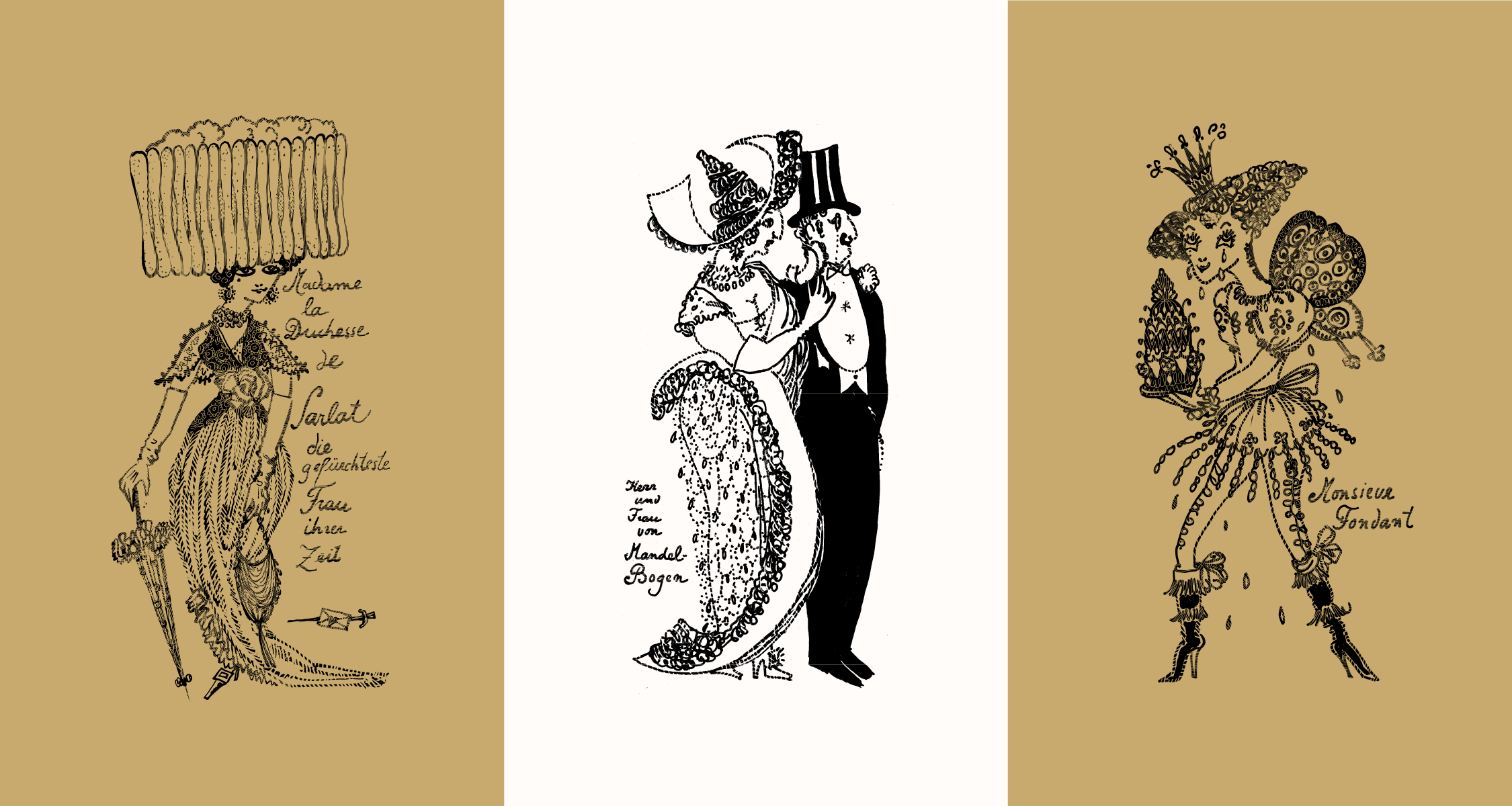
Berzeviczy developed various characters inspired by Viennese aristocratic culture and desserts served at Demel.
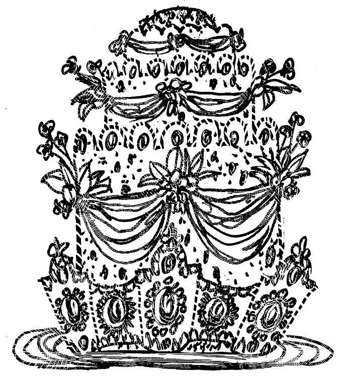
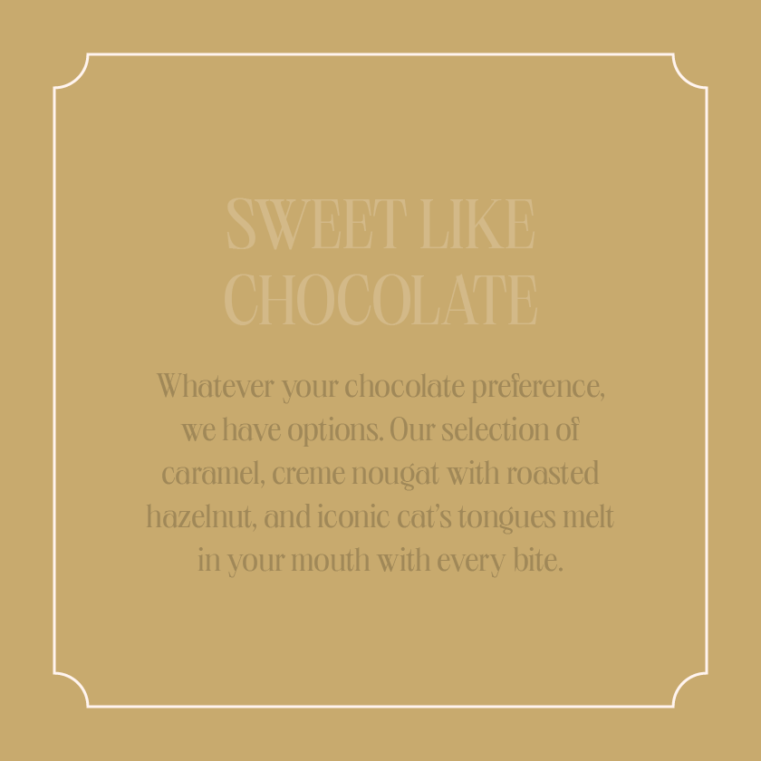

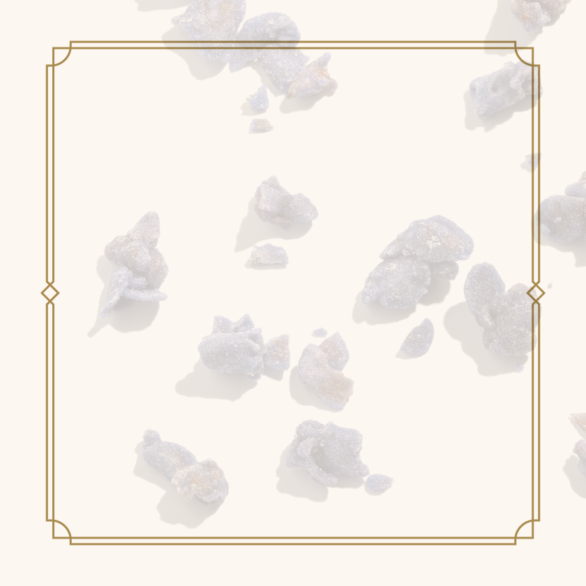
Inspired by the mouldings and scalloped mirror frames in Demel's baroque salon, a range of frames exist as holding devices for copy and imagery.
PHOTOGRAPHY
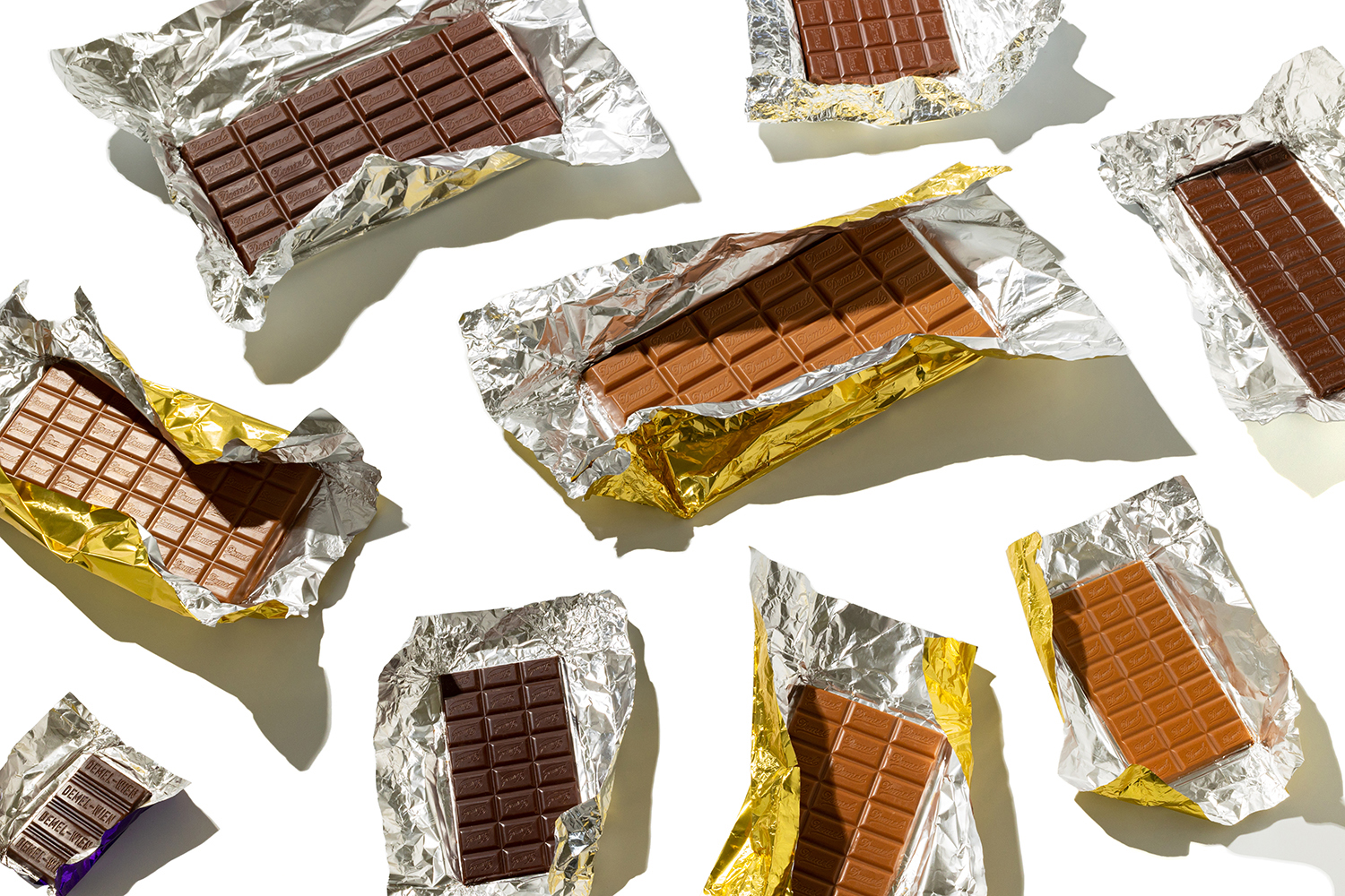
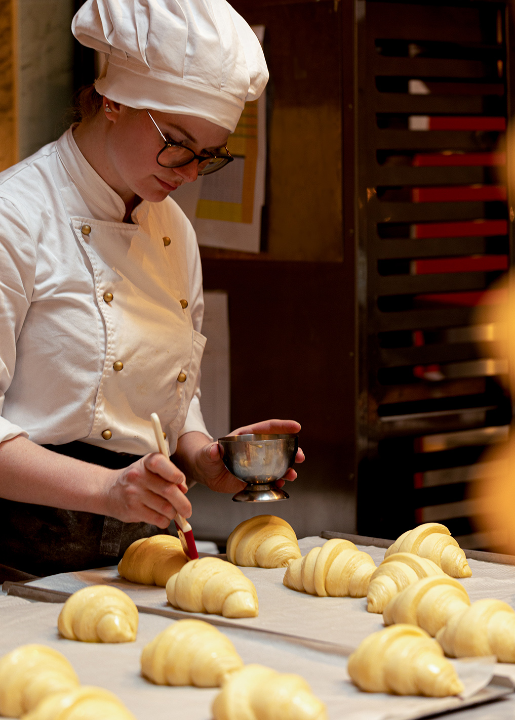
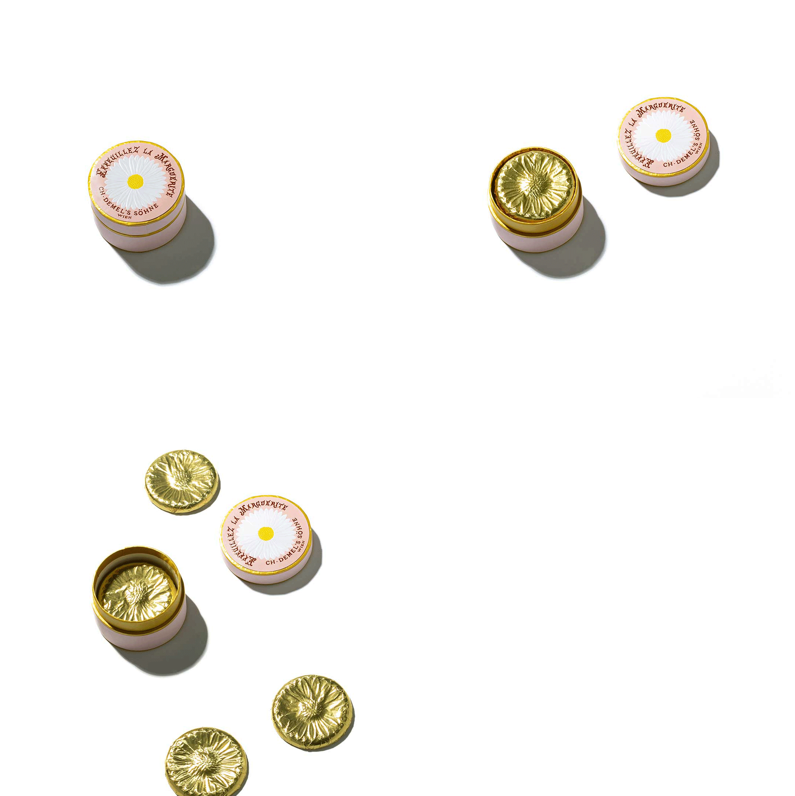
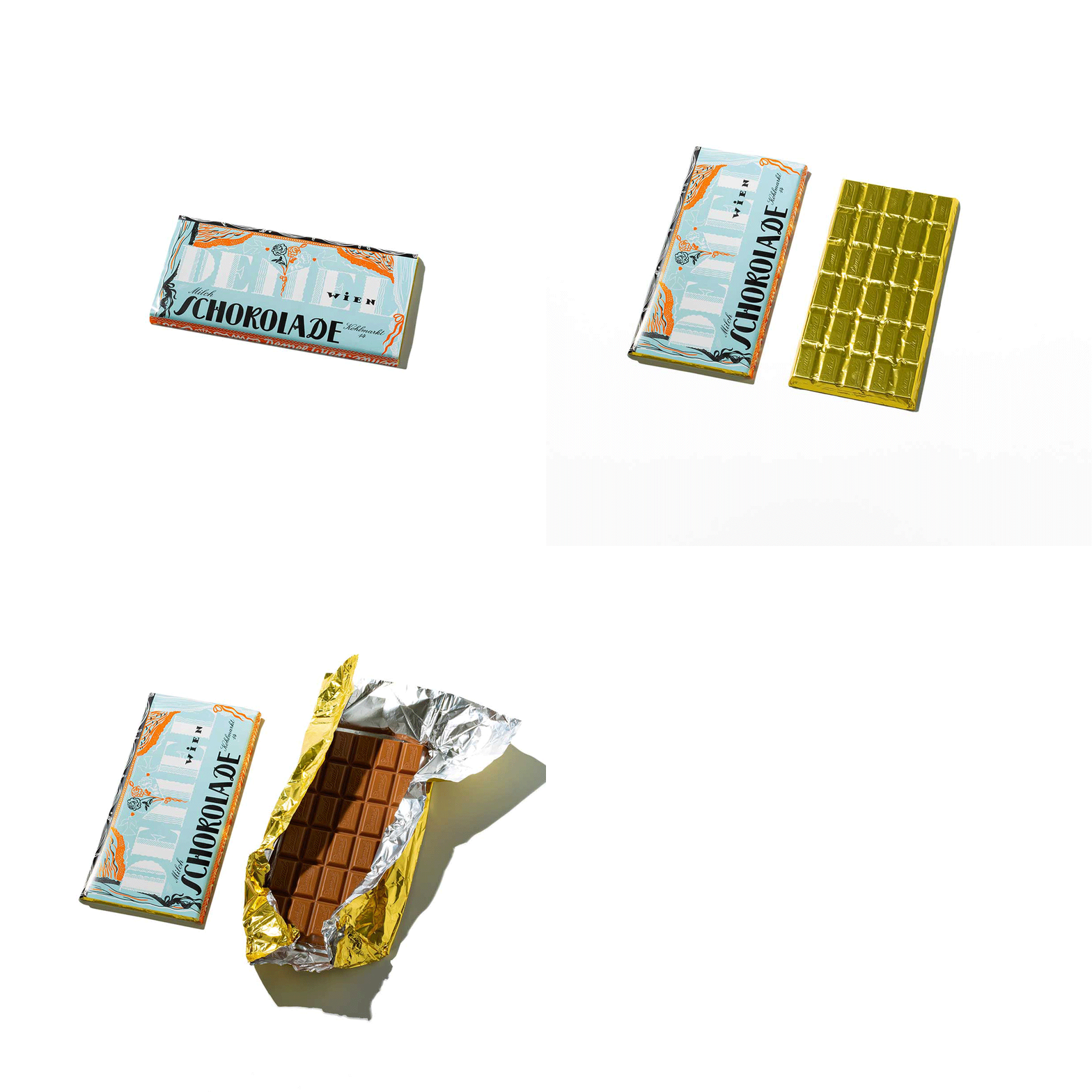
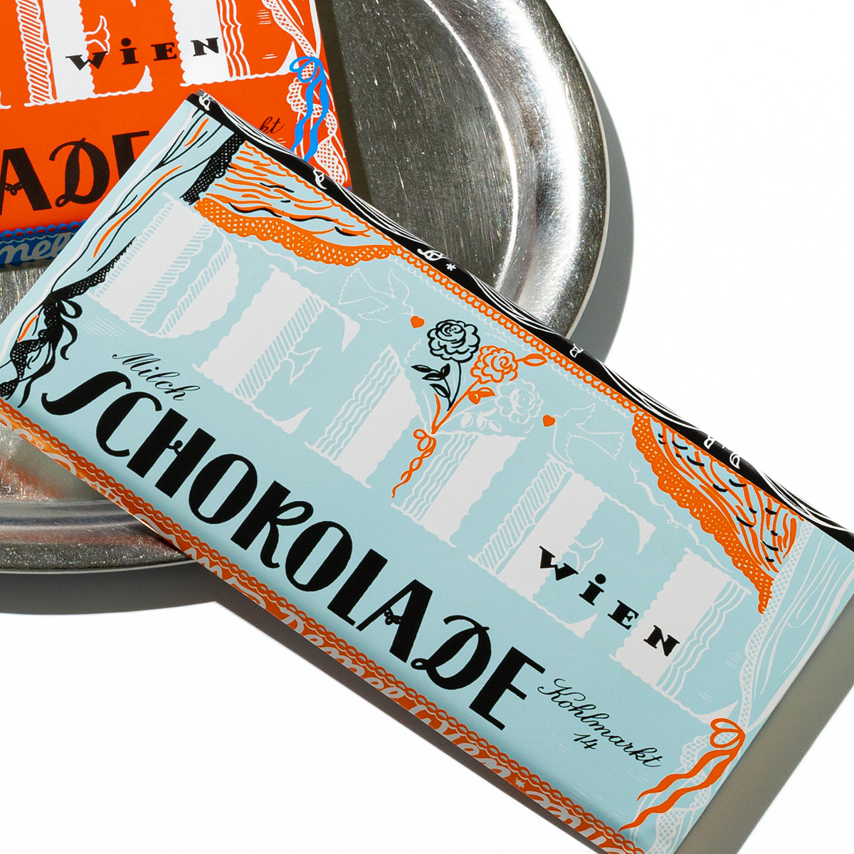
Demel's products are all lovingly hand made and wrapped at Kohlmarkt 14. No preservatives are added and most recipes date back centuries. It felt important to emphasise how decadent these cakes, chocolates, and sweets are by making them look especially sumptuous in imagery.
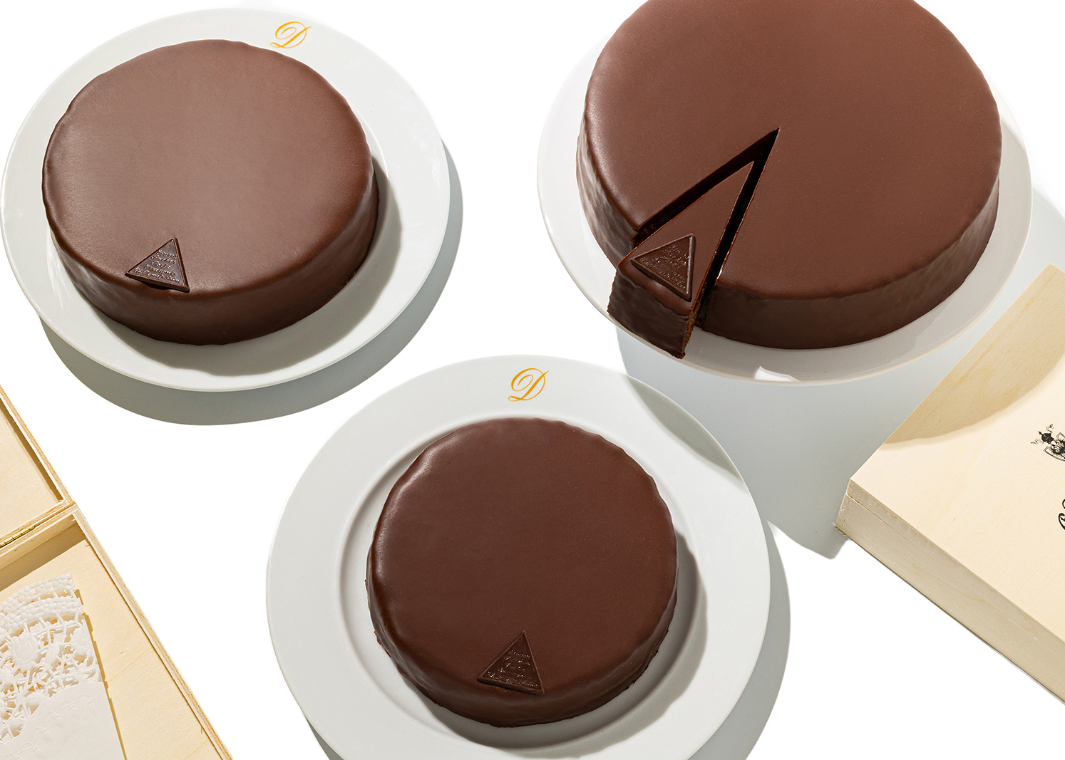
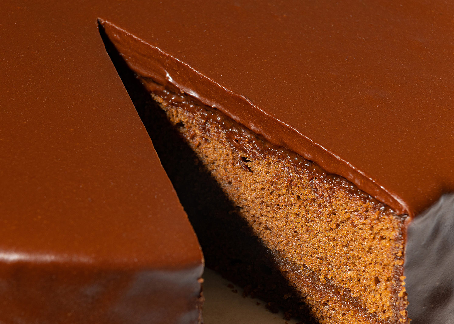
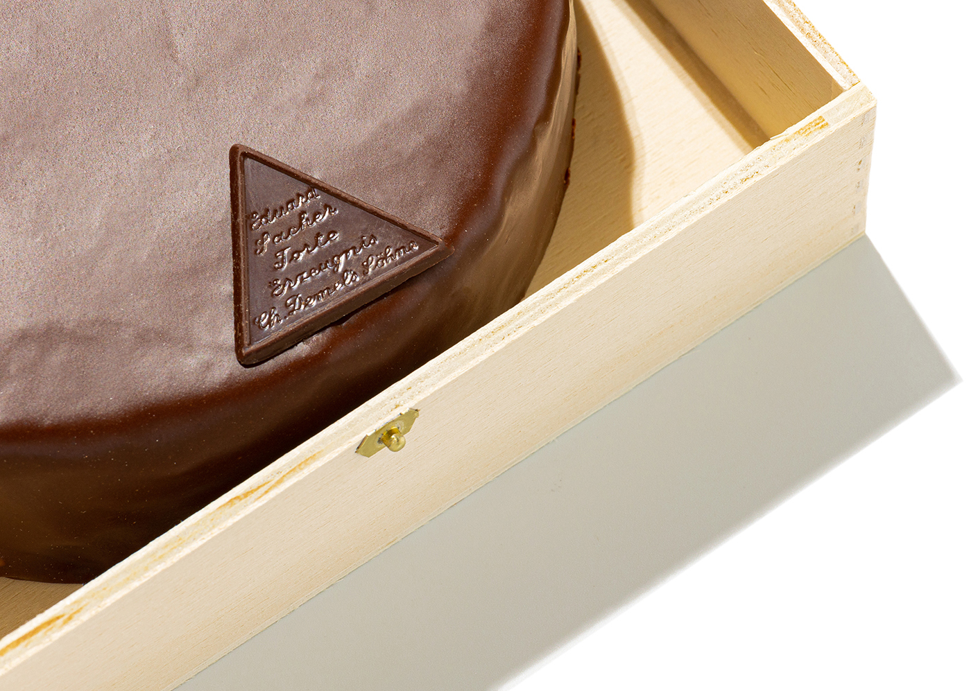
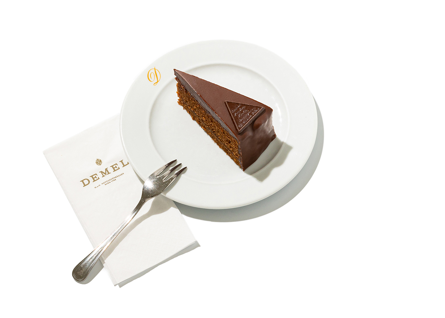
Capturing the quality of the cakes on camera was crucial. There was minimal re-touching to make all freshly made products look realistic while decadent.
←
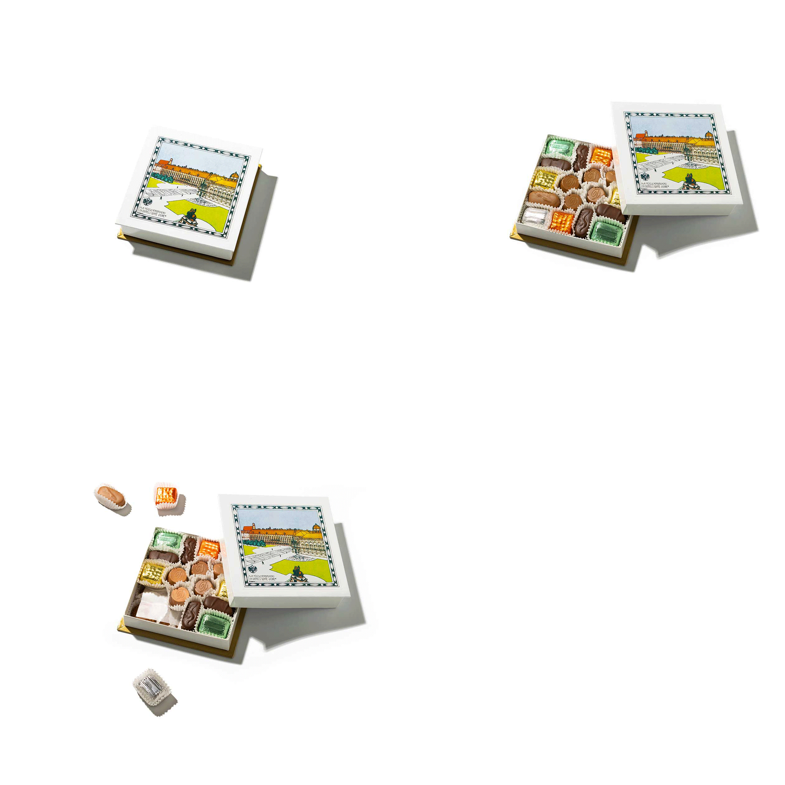
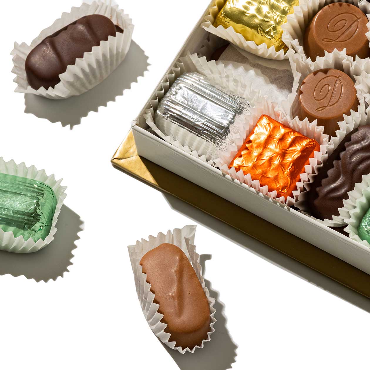
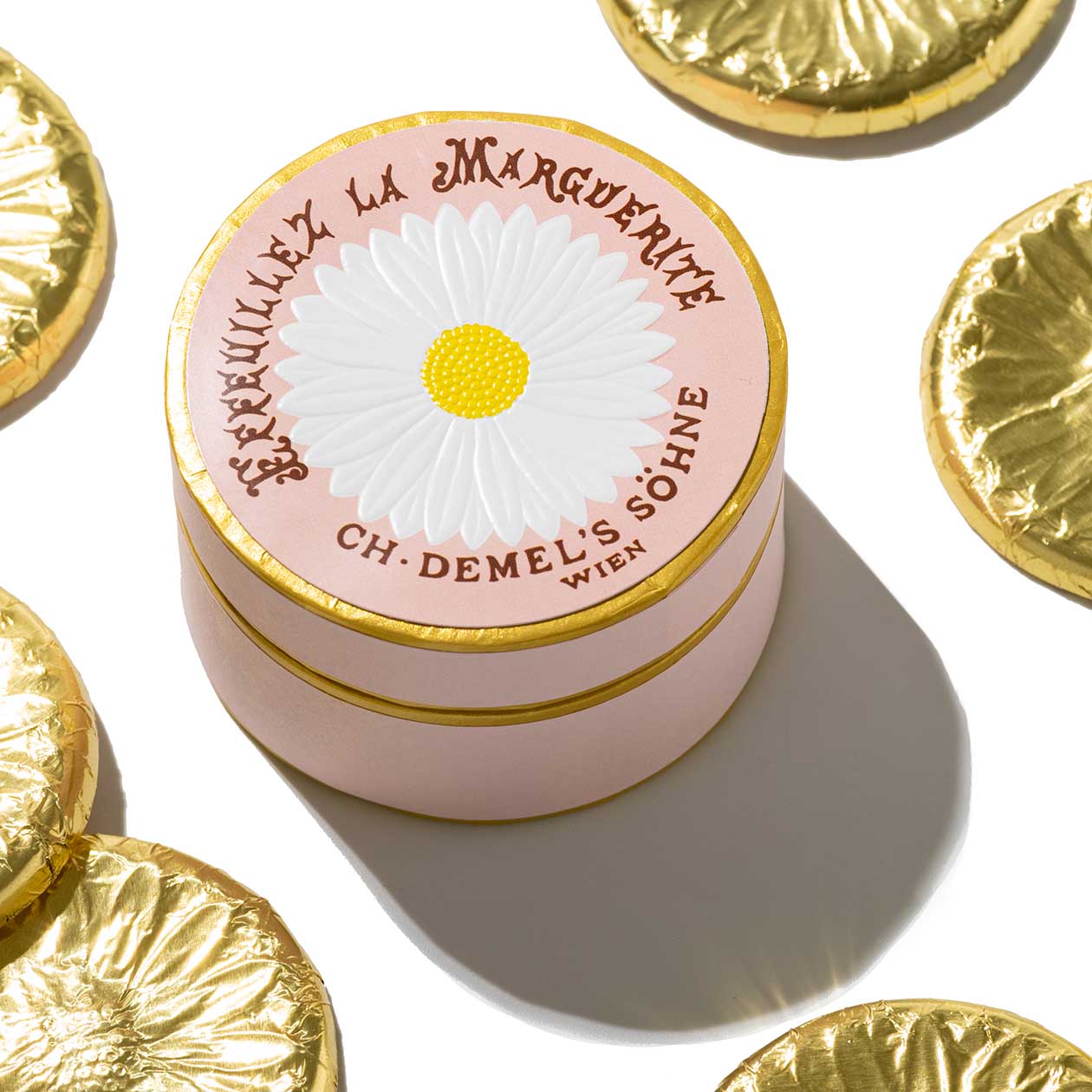
The goal was for bonbonniers and chocolate bars to look like precious objects or glittering jewelery boxes.
BRAND APPLICATIONS
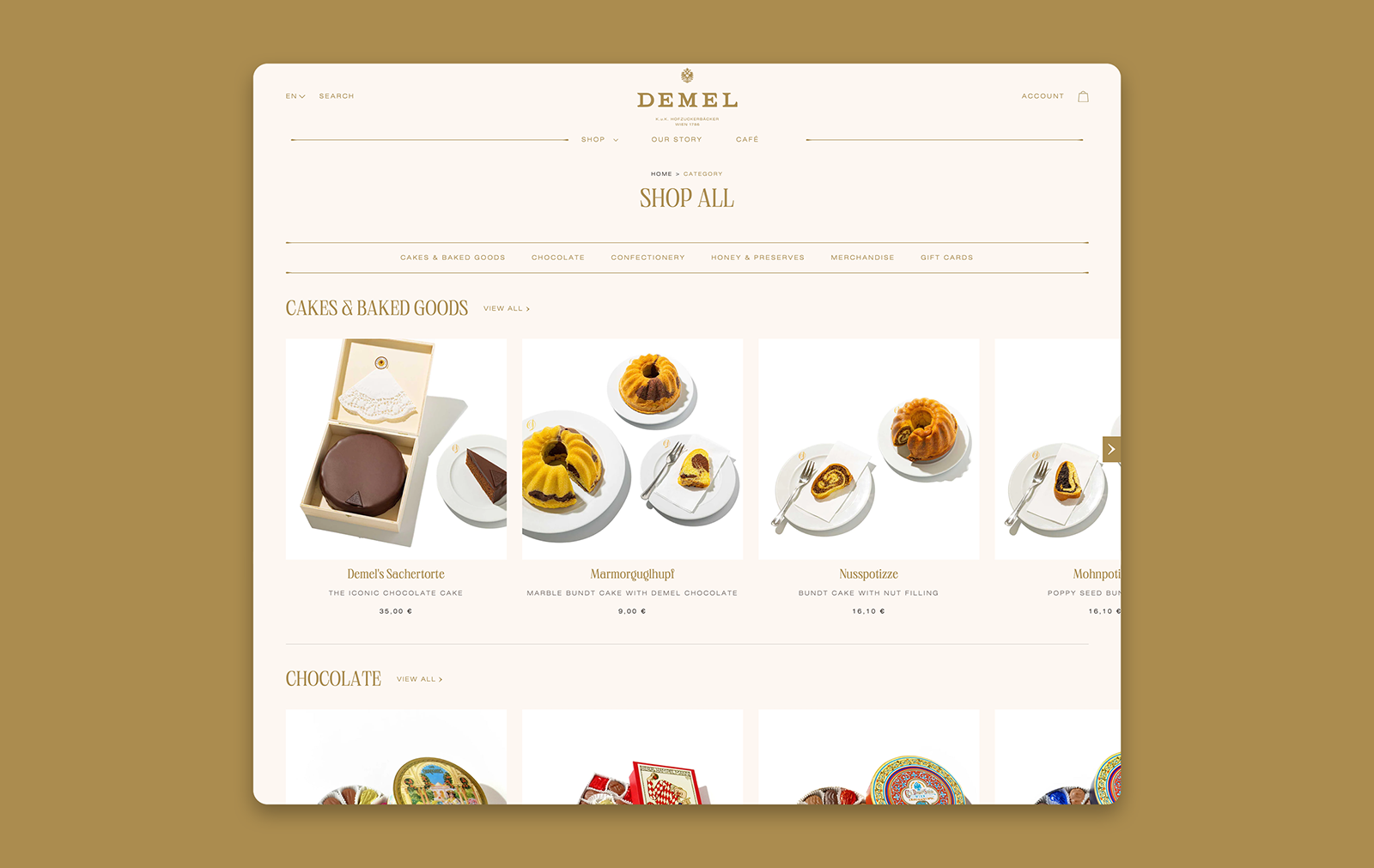
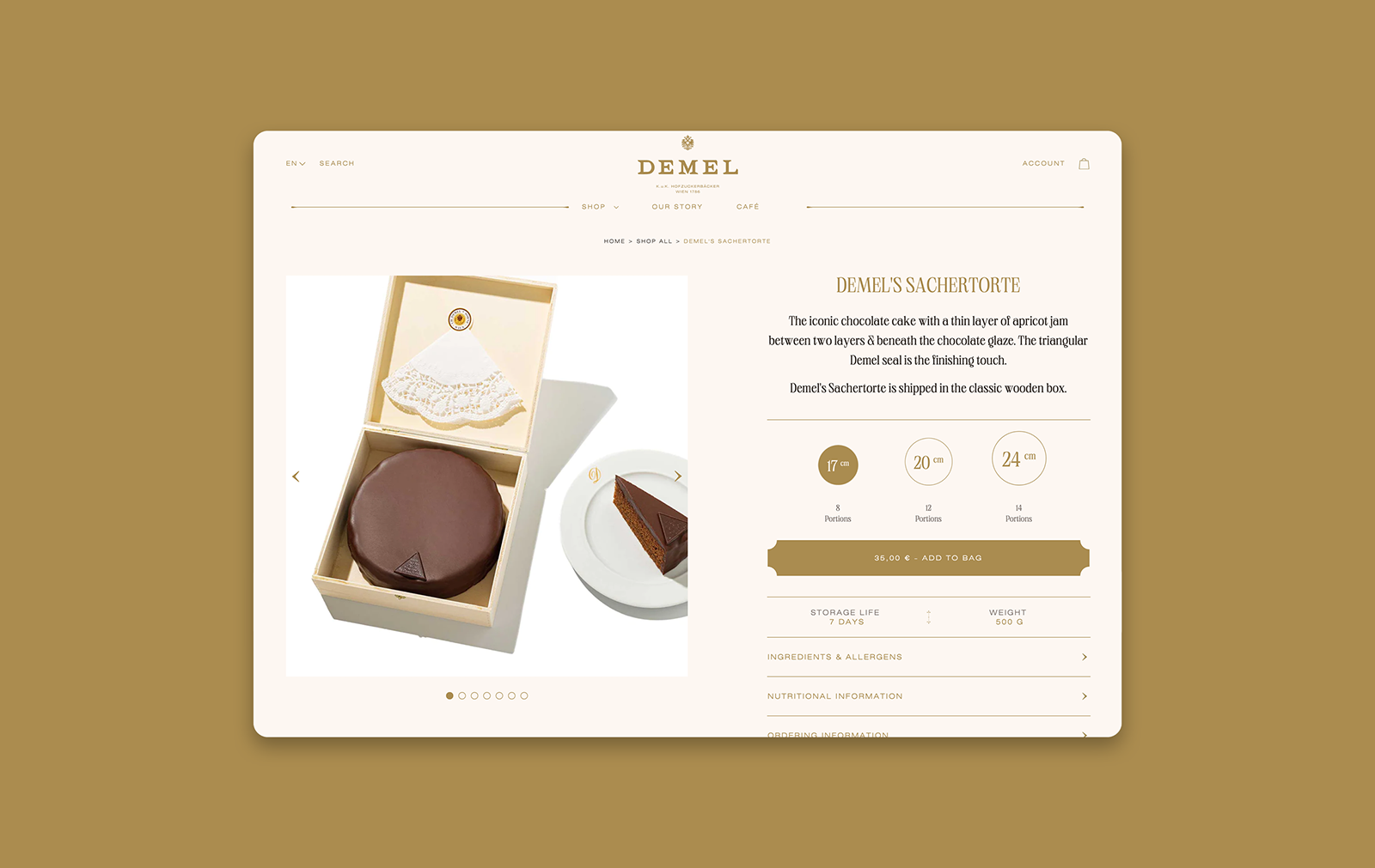
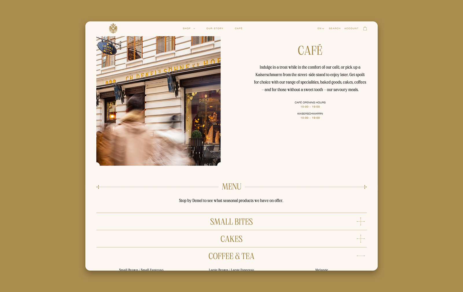
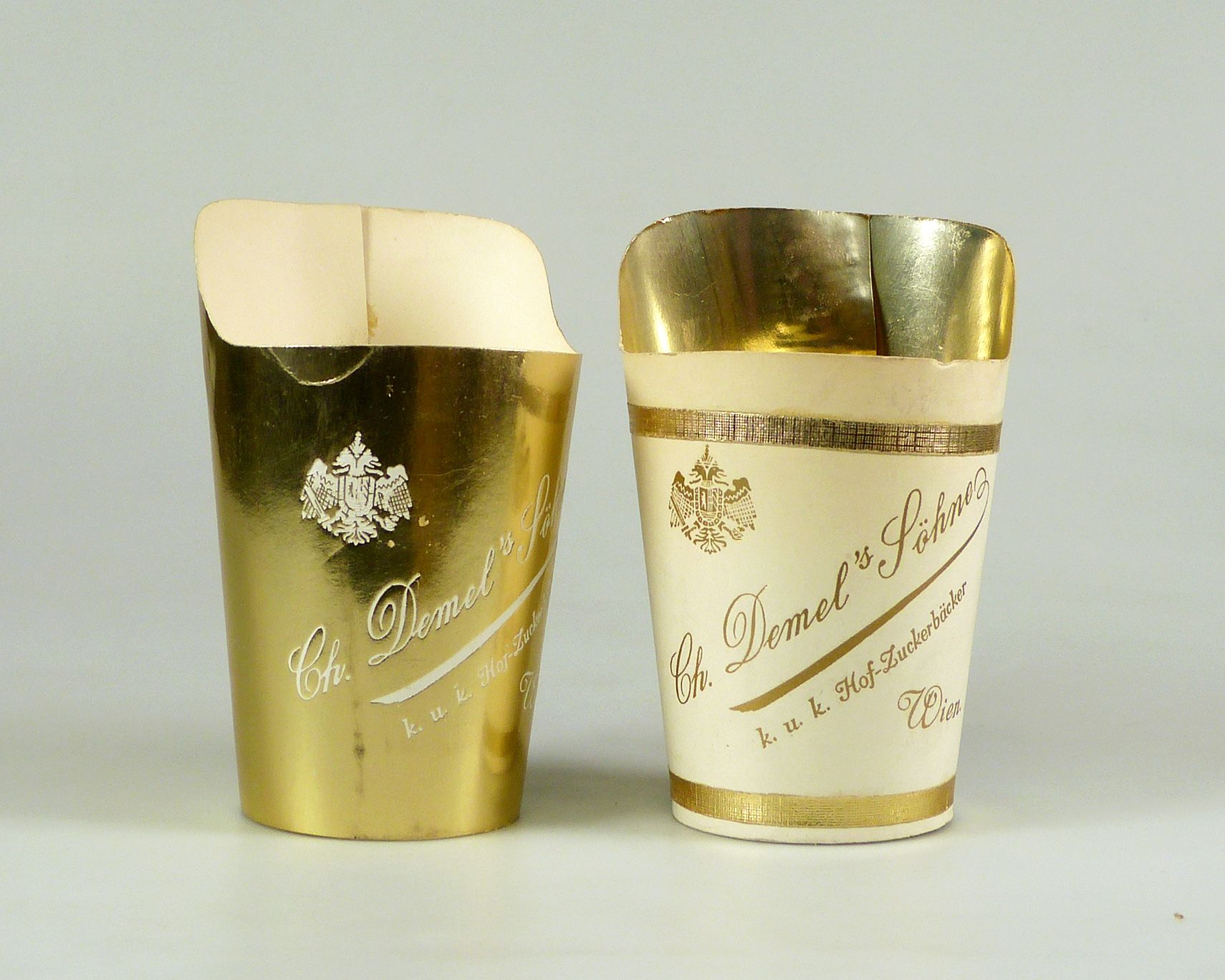
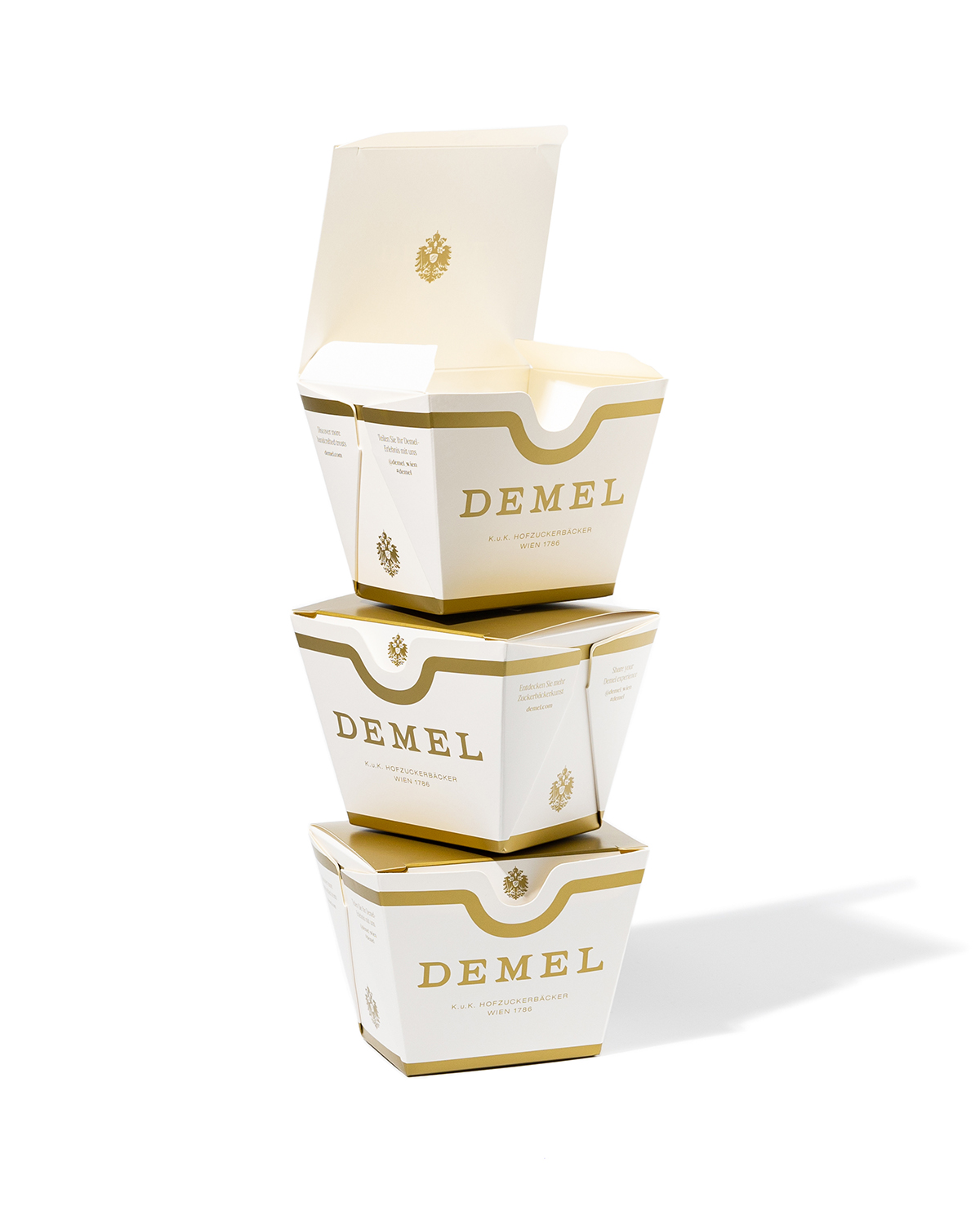
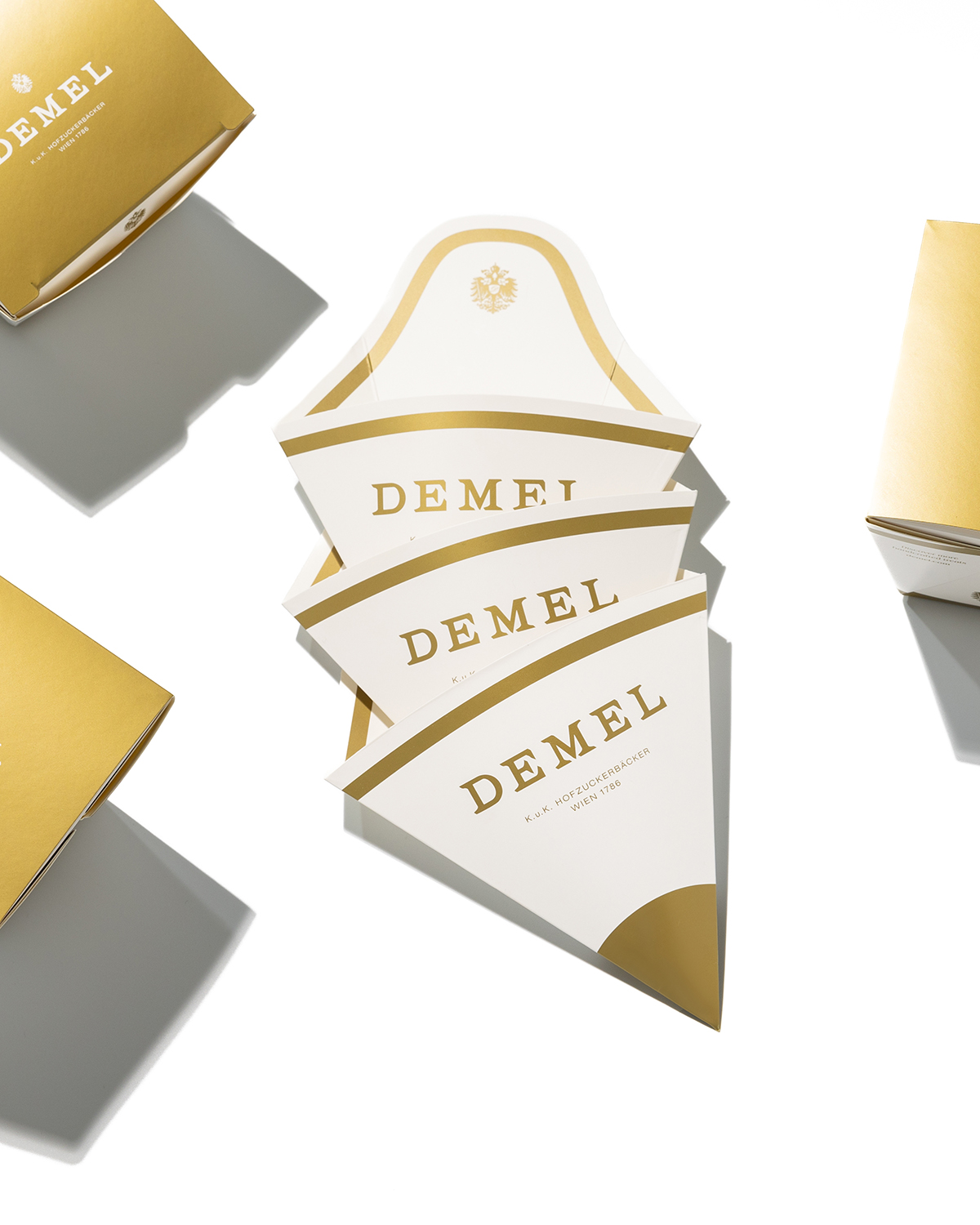
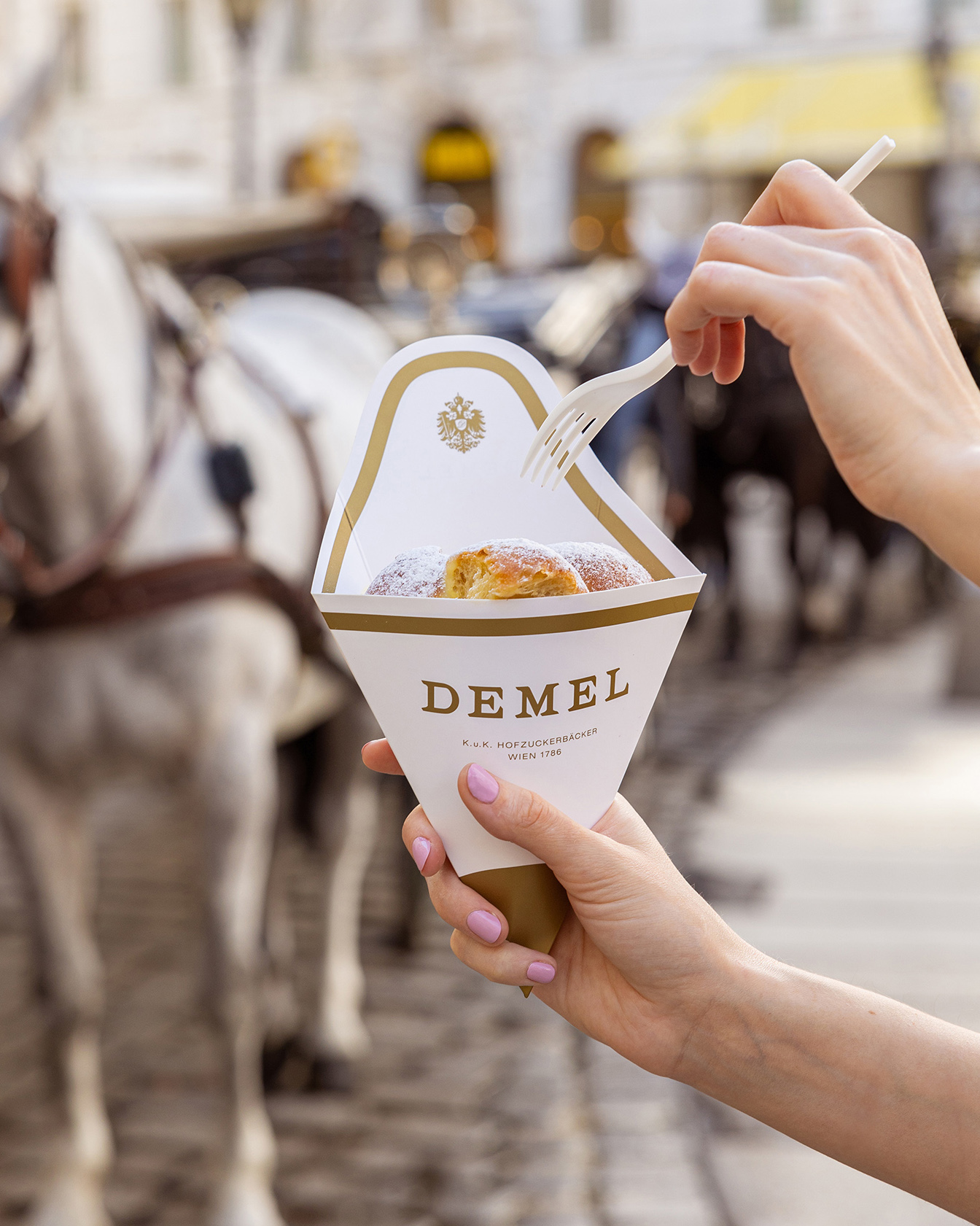
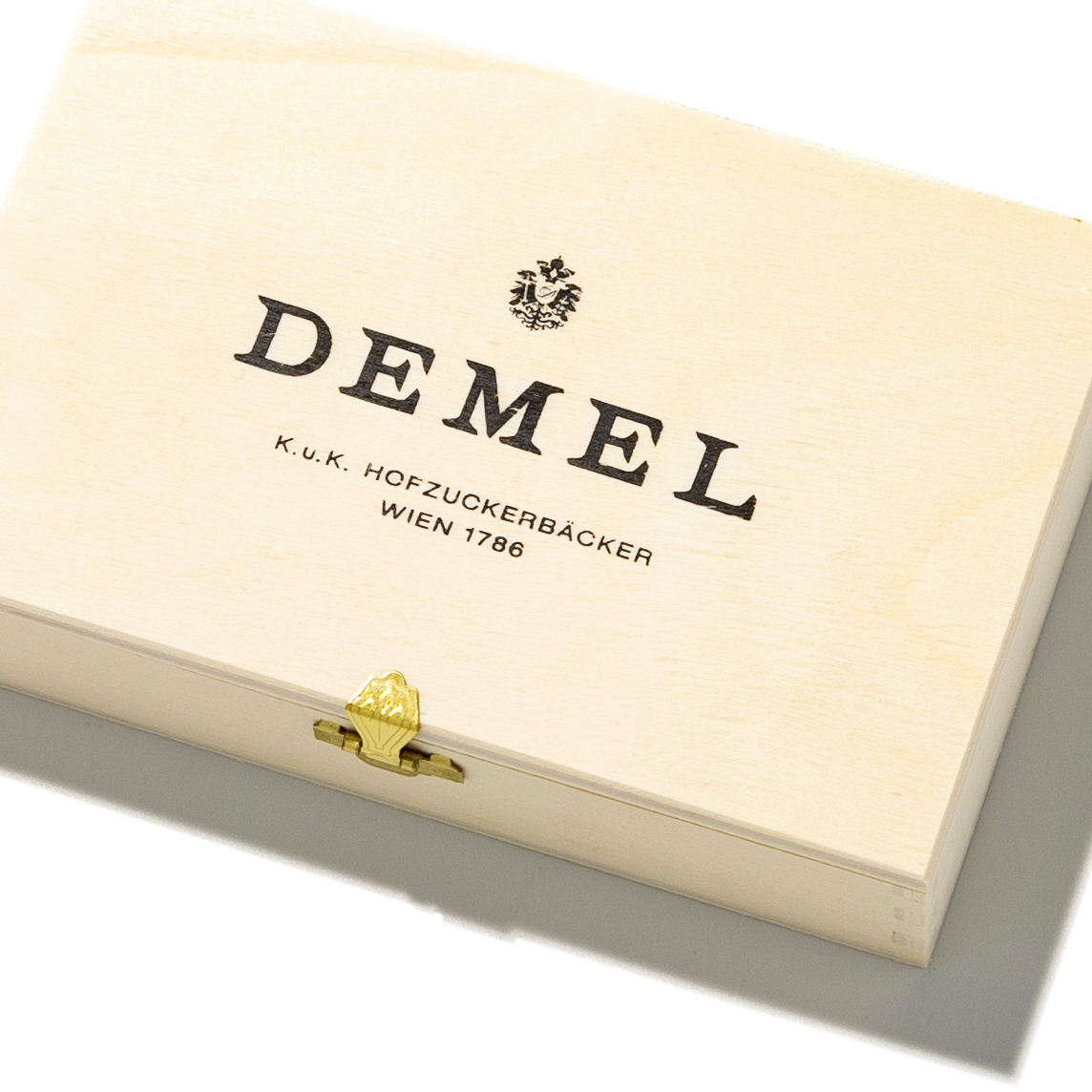
The extensive archive of Demel's packaging acted as inspiration for the reimagining of the new take-away boxes.
